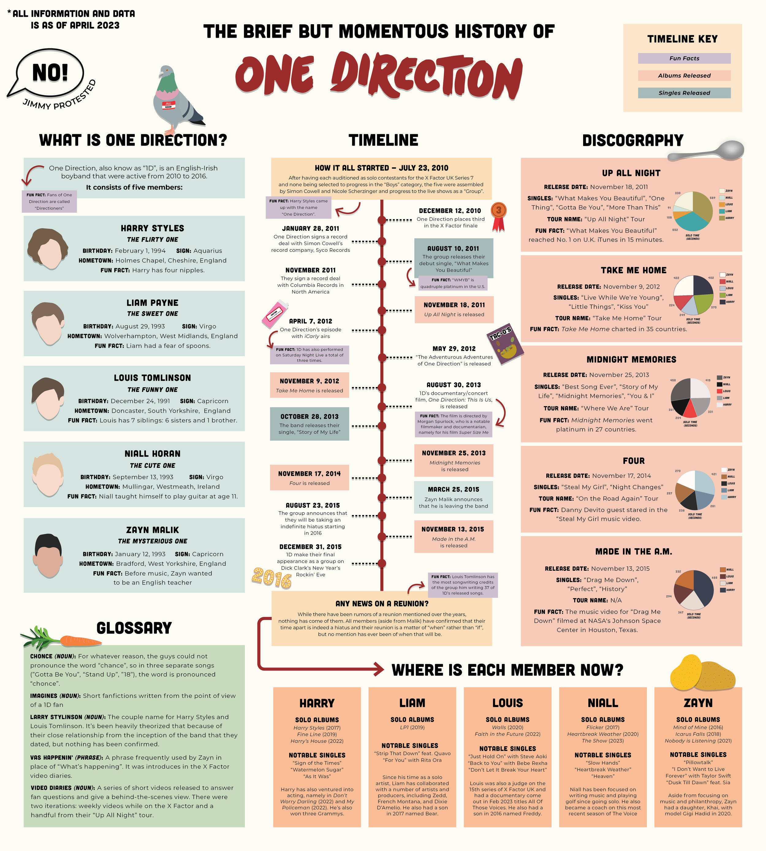
infographic: One Direction
Created: March/April 2023
Project Overview: Our objective was to create an illustrated infographic that translates accurate data into easy to understand and visually appealing visuals to tell a story, persuade, entertain, etc.
What I Used:
Adobe Illustrator
My Process:
When we were initially told about the infographic assignment, I immediately thought I was going to make mine about otters. Aside from them being my favorite animal, they are very interesting creatures that I could find a lot of information about, both for graphics and data visualization. However, when we were in class on April 12th and we were going around the classroom talking about our ideas for our infographics, my professor mentioned to someone about how they could start going in one direction with their project and then decide to go another when it hit me: I could do an infographic on the infamous boyband One Direction. I’ve been a fan of them since 2012, so it felt right that I finally apply my decade of knowledge and adoration into a tangible project. When I initially spun up my infographic, I thought it was only going to be a timeline with the occasional fun fact. However, when we presented our progress as a class on April 19th and you said that I should add more information and “get obsessive”, I decided to run with it. Aside from the years of knowledge I already had, I did cumulative hours of research across Wikipedia, YouTube, my collection on One Direction magazines, and news articles to ensure that my information was accurate. My research also reminded me off all the fun inside jokes between the group and the fans, so I decided to use those as graphics interspersed around the infographic.
To create my infographic, I worked solely out of Adobe Illustrator. While I started with a long, narrow artboard, I expanded it in length and width as I added more topics. To create the boxes of information, I relied heavily on the rectangle tool and type tool. However, to make sure that everything was evenly spaced and lined up properly, the Align panel was my best friend, namely the “Alight to Key Object” function. I used a simple pastel color palette and the Cubano and Montserrat fonts as the base of the infographic. For the graphs pertaining to solo times for each guy on each album, I used the graph tool to create each pie graph and recolored each of them to match the color palette of their respective album. Additionally, I also added text boxes next to each section to depict the number it represents. Each graphic was traced from a reference image using the curvature pen tool as well as the eyedropper tool to pick up the correct color.
While I absolutely could have included more information than I did, my goal was to give a full but comprehensive overview of the band as well as its current “status” for people who might be less of a fan than I am. I hope to expand on more niche ideas of One Direction in infographic form one day, but nonetheless, I’m happy with how this infographic turned out. It was able to cover everything I wanted to and absolutely pushed me out of my comfort zone in terms of layout and data visualization. I’m very excited to add this project to my portfolio.
What I Learned:
As I’m writing this, it’s been a year since I created this infographic, and I would have to say that it’s still my favorite work of all of my creative projects thus far. I was such a big fan of them when I was younger, so it was so fun to be able to delve into that obsession again and create something that both represents that obsession and I’m proud of.
Larger version at the bottom


